Title: Quick moderation
Post by: emanuele on December 07, 2013, 11:56:49 am
Post by: emanuele on December 07, 2013, 11:56:49 am
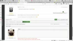
See the attachment.
We have (still) two approaches to quick moderation: icons and checkboxes. I'm not sure if you prefer one or the other, I know from time to time, one of the two would be more useful than the other (usually icons when just one topic is the one to change, checkboxes when many are involved).
The idea here would be to merge the two things.
Before we start thinking about accessibility and so on, what I have in mind is basically remove the icons as a "standard" way to deal with quick moderation. In what I have in mind there just "quick moderation on/off".
Icons become a javascript friendliness available when you have quick moderation on, so you have QM on, you hover a check box, the "round of icons" pops up. At that point you can:
1) use one of the icons to operate on the topic,
2) tick the checkbox.
If you do 1, obviously the normal moderation action is performed.
If you do 2, the popup will not appear any more on that page and you will have to use only checkboxes instead.
The picture attached is just that: a picture. No coding involved, just some boxes and images in inkscape. O:-)
Title: Re: Quick moderation
Post by: [SiNaN] on December 07, 2013, 12:29:48 pm
Post by: [SiNaN] on December 07, 2013, 12:29:48 pm
That looks pretty cool and useful. It also looks like the best way to have both of those together.
Title: Re: Quick moderation
Post by: emanuele on December 07, 2013, 12:49:26 pm
Post by: emanuele on December 07, 2013, 12:49:26 pm
If you say so you are tempting me to make it instead of fixing all the other bugs I have to fix!! :P
Title: Re: Quick moderation
Post by: [SiNaN] on December 07, 2013, 01:30:19 pm
Post by: [SiNaN] on December 07, 2013, 01:30:19 pm
lol, you should probably wait for the opinions of some sane people before doing any serious work on it...
Title: Re: Quick moderation
Post by: emanuele on December 07, 2013, 02:07:37 pm
Post by: emanuele on December 07, 2013, 02:07:37 pm
And... where do I find any sane person? :P
Title: Re: Quick moderation
Post by: Spuds on December 07, 2013, 04:10:28 pm
Post by: Spuds on December 07, 2013, 04:10:28 pm
Quote from: emanuele – If you say so you are tempting me to make it instead of fixing all the other bugs I have to fix!! :P
Title: Re: Quick moderation
Post by: emanuele on December 07, 2013, 05:05:46 pm
Post by: emanuele on December 07, 2013, 05:05:46 pm
/me haz fixed something! :D
I also worked on that a tiny bit... O:-)
I also worked on that a tiny bit... O:-)
Title: Re: Quick moderation
Post by: emanuele on January 15, 2015, 08:45:10 am
Post by: emanuele on January 15, 2015, 08:45:10 am
Memo: http://paulkinzett.github.io/toolbar/
Title: Re: Quick moderation
Post by: Spuds on January 15, 2015, 02:41:12 pm
Post by: Spuds on January 15, 2015, 02:41:12 pm
Cool ... need to fork that and change it to use font-awesome icons !
Title: Re: Quick moderation
Post by: emanuele on February 08, 2021, 04:00:51 pm
Post by: emanuele on February 08, 2021, 04:00:51 pm
Bump! :P
Title: Re: Quick moderation
Post by: Antechinus on February 08, 2021, 04:21:08 pm
Post by: Antechinus on February 08, 2021, 04:21:08 pm
Minor presentation point: might be better to provide the options in a straight line across the screen, for easier scanning in practice. ;)
Sticky - Lock - Move - Delete - Checkbox could work.
Sticky - Lock - Move - Delete - Checkbox could work.
Title: Re: Quick moderation
Post by: Spuds on February 08, 2021, 05:09:07 pm
Post by: Spuds on February 08, 2021, 05:09:07 pm
I added it to the tracked and assigned @emanuele :D
Title: Re: Quick moderation
Post by: emanuele on February 08, 2021, 05:38:54 pm
Post by: emanuele on February 08, 2021, 05:38:54 pm
lol
Title: Re: Quick moderation
Post by: emanuele on March 02, 2021, 04:01:00 pm
Post by: emanuele on March 02, 2021, 04:01:00 pm
I'm trying to adapt the script you mentioned @Spuds and... it may take a while. xD
I started trying to use it "as is", but it it looks pretty messy when multiple checkboxes are selected (the script creates a number of toolbars, one for each element they are attached to and it toggles the visibility accordingly to the selection, etc., so I couldn't find a way to make it work consistently, also because it doesn't expose much, and even the events don't seem that much useful :-\ ), so for now I'm tearing it apart and picking just the useful bits (it shouldn't be a huge problem since the code has not been updated for years lol).
Oh well, more to come!
Title: Re: Quick moderation
Post by: Spuds on March 03, 2021, 06:45:16 pm
Post by: Spuds on March 03, 2021, 06:45:16 pm
nods ... its one of the side "benefits" of github code, one never knows when it will be abandoned and you are left on your own :P
Title: Re: Quick moderation
Post by: Arantor on March 11, 2021, 02:42:17 pm
Post by: Arantor on March 11, 2021, 02:42:17 pm
Checkboxes, only, forever. Keep it simple, keep it clean.
Title: Re: Quick moderation
Post by: Bloc on March 12, 2021, 04:19:50 am
Post by: Bloc on March 12, 2021, 04:19:50 am
The idea of hovering over a checkbox to get a menu is cool..but what to do with touch devices - touch the errr..checkbox? :)
Inclined to agreed with Arantor, checkboxes are great as is. One idea would be to make the actual choice buttons (those that do the work when checkboxes are ticked) stay fixed on the page. That way you could tick a few - or just one - and still be able to do the action without having to scroll down. The fixed bar could set in when any checks are being ticked, perhaps.
On that note..I might try this as an idea myself. :D
Title: Re: Quick moderation
Post by: Arantor on March 12, 2021, 03:36:49 pm
Post by: Arantor on March 12, 2021, 03:36:49 pm
You'll be in good company, it's basically what XenForo does.
Title: Re: Quick moderation
Post by: Bloc on March 13, 2021, 04:51:52 am
Post by: Bloc on March 13, 2021, 04:51:52 am
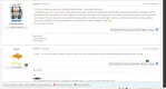
Tried it now and keeping it. :) The idea of making the moderationbuttons fixed that is. I'll probably take out the option of showing mini-links/buttons too and just have the checkboxes. Attached a few screenshots.. 1) no checkboxes checked 2) one(or several) checked


Title: Re: Quick moderation
Post by: Antechinus on March 14, 2021, 03:41:30 am
Post by: Antechinus on March 14, 2021, 03:41:30 am
^ Make that the default Accept no substitutes. :D
Title: Re: Quick moderation
Post by: Spuds on May 26, 2022, 02:36:37 pm
Post by: Spuds on May 26, 2022, 02:36:37 pm
Time to give this old topic a kick :P
There are a few items, I'll place them in separate posts. First up is Quick Moderation on the topic (display.template) page.
Currently, If you have show QM as icons,
Currently, If you have show QM as checkboxes
Simple enough, using icons you loose access to certain actions.
Current View

I've updated the code on my local to drop use icons and made the change such that when you click one of the checkboxes, the button bar will sticky itself to the bottom of the page such that you don't have to scroll to find it.
New View
There are a few items, I'll place them in separate posts. First up is Quick Moderation on the topic (display.template) page.
Currently, If you have show QM as icons,
- You get the button bar across the bottom like :: [move] [remove] [lock] [sticky] [merge]
- Specific buttons depends on permissions
- lock / sticky may say un lock or un sticky based on the topic status
- There are no icons on this page, hence the name show as icons :P
Currently, If you have show QM as checkboxes
- You get all of the above PLUS a checkbox next to each message in that thread
- Selecting the checkbox exposes the option to [remove] or [split] selected messages
- Button bar is still at the bottom of all the messages
Simple enough, using icons you loose access to certain actions.
Current View
I've updated the code on my local to drop use icons and made the change such that when you click one of the checkboxes, the button bar will sticky itself to the bottom of the page such that you don't have to scroll to find it.
New View
Title: Re: Quick moderation
Post by: Spuds on May 26, 2022, 03:55:11 pm
Post by: Spuds on May 26, 2022, 03:55:11 pm
Next up is Quick Moderation (QM) in the Topic Listing (messageindex.template)
Currently, If you have show QM as icons,
Currently, If you have show QM as checkboxes
Simple enough, using icons, once again, looses quick access to certain actions.
Current View


I've updated the code on my local to drop the use Icons and the checkbox select has been replaced with a button bar similar to what you have on the display page. I can't think of any reason to be providing different UI experiences on different pages for what is basically the same functionality.
I also changed is so the button bar is not visible until you select one of the checkboxes, and then it becomes visible and is stuck to the bottom of the viewport. It (like display) also shows a counter indicating number of topics that action could be applied to. Also to minimize the number of buttons, approve/restore only become visible if you select, say a message that needs to be approved.
New View


Currently, If you have show QM as icons,
- You do not get a button bar across the bottom
- You do get UP TO 4 icons next to each message : [move] [remove] [lock] [sticky]
- The icons that appear are based on your permissions for that message
- You do not have QM access to approve, restore, merge or mark as read (individual)
Currently, If you have show QM as checkboxes
- You get a Select Pulldown at the bottom with [approve] [remove] [lock/un] [sticky/un] [move] [merge] [mark as read]
- There is a Move to Select that is only active if you select Move from the above Select
- A Checkbox next to each topic
- Selecting the checkbox exposes nothing
Simple enough, using icons, once again, looses quick access to certain actions.
Current View
I've updated the code on my local to drop the use Icons and the checkbox select has been replaced with a button bar similar to what you have on the display page. I can't think of any reason to be providing different UI experiences on different pages for what is basically the same functionality.
I also changed is so the button bar is not visible until you select one of the checkboxes, and then it becomes visible and is stuck to the bottom of the viewport. It (like display) also shows a counter indicating number of topics that action could be applied to. Also to minimize the number of buttons, approve/restore only become visible if you select, say a message that needs to be approved.
New View
Title: Re: Quick moderation
Post by: Antechinus on May 26, 2022, 10:45:14 pm
Post by: Antechinus on May 26, 2022, 10:45:14 pm
Ok, that'll work.
BTW, I recently ditched the "jump to" on MessageIndex and Display. Reason being that, in all the years I've been using SMF/Elk, the only time I have ever used either "jump to" was when I needed to test them to make sure they worked. Apart from that, never use them at all, so ditched them. :)
BTW, I recently ditched the "jump to" on MessageIndex and Display. Reason being that, in all the years I've been using SMF/Elk, the only time I have ever used either "jump to" was when I needed to test them to make sure they worked. Apart from that, never use them at all, so ditched them. :)
Title: Re: Quick moderation
Post by: Spuds on May 27, 2022, 08:30:55 am
Post by: Spuds on May 27, 2022, 08:30:55 am
I should have also noted above that the icons were IMO unfriendly to use. Small click zone and proximity to each other on/across messages.
I was also wondering about the usefulness of the jump to box .. Mostly because I noticed a small bug that I had to fix, so it was not actually working right anyway. Never being reported shows how much its used.
The jumpbox also has the odd "on hover" loading behavior. This causes a delay when you go to use the control, with the bonus that row may jump / reflow. I moved that to an after load event as a test but may now just drop the stupid thing.
Title: Re: Quick moderation
Post by: emanuele on May 27, 2022, 07:07:09 pm
Post by: emanuele on May 27, 2022, 07:07:09 pm
Yeah, jump to is a pain in the plumbers crack.
And I don't remember to have ever used it either.
I like that @Spuds is always able to put in practice what I can barely describe.:laughing:
And I don't remember to have ever used it either.
I like that @Spuds is always able to put in practice what I can barely describe.:laughing:
Title: Re: Quick moderation
Post by: Spuds on May 27, 2022, 07:24:14 pm
Post by: Spuds on May 27, 2022, 07:24:14 pm
I have topic display and topic listing done ... still have to look at search and ?? is it new posts? can't remember right now. Well at least each implementation of QM is different so it keeps you sharp LOL
Title: Re: Quick moderation
Post by: emanuele on May 27, 2022, 07:33:35 pm
Post by: emanuele on May 27, 2022, 07:33:35 pm
That's the funny part of it :P
Title: Re: Quick moderation
Post by: radu81 on May 28, 2022, 03:34:36 am
Post by: radu81 on May 28, 2022, 03:34:36 am
I always used checkboxes and not icons, Jump To probably used a couple of times in the last 5 years.
I like what you did with the button bar on the bottom, but what happens when you change page, it will keep those topic selected and display the button bar?
I like what you did with the button bar on the bottom, but what happens when you change page, it will keep those topic selected and display the button bar?
Title: Re: Quick moderation
Post by: Spuds on May 28, 2022, 08:56:46 am
Post by: Spuds on May 28, 2022, 08:56:46 am
Quote from: radu81 – ... what happens when you change page, it will keep those topic selected and display the button bar?
Was that the behavior with the previous select box?
I guess that could be useful only for merging topics maybe? Of course if its across multiple pages you may have to play find waldo to remove the bar (or log out / in to clear your session)
Title: Re: Quick moderation
Post by: emanuele on May 28, 2022, 10:36:56 am
Post by: emanuele on May 28, 2022, 10:36:56 am
Across pages is one of those things that are quite cool to have, but quite annoying to code because I'd say using session is the only way (unless you pass stuff through the URL, but that's so uncool I think) and session, to me, is always a pain.
The old select box worked only for the current page as far as I remember.
Multi-page I see it potentially useful in case of spam bombarding (i.e. you want to delete a bunch of pages of topics/posts in one go), but sounds like a rather edge case that I would not be bothered. :man_shrugging:
The old select box worked only for the current page as far as I remember.
Multi-page I see it potentially useful in case of spam bombarding (i.e. you want to delete a bunch of pages of topics/posts in one go), but sounds like a rather edge case that I would not be bothered. :man_shrugging:
Title: Re: Quick moderation
Post by: emanuele on May 28, 2022, 10:37:30 am
Post by: emanuele on May 28, 2022, 10:37:30 am
Title: Re: Quick moderation
Post by: radu81 on May 28, 2022, 01:25:32 pm
Post by: radu81 on May 28, 2022, 01:25:32 pm
Quote from: Spuds – Was that the behavior with the previous select box?
Quote from: emanuele – The old select box worked only for the current page as far as I remember.
When I start using the prefixes I had to apply prefixes to hundreds of old topics, with Elkarte behavior it will take some time, on a forum with this feature you can can select different topics switching pages, then apply a prefix for all selected topics. Anyway I "solved" that by showing 500 topics on a page. (only on my account).
Could be a nice and comfortable feature, but I guess it's not 2 lines of code to write. Mine was just a question, I am not asking to add this feature in the core ;)
Title: Re: Quick moderation
Post by: Spuds on May 28, 2022, 06:41:20 pm
Post by: Spuds on May 28, 2022, 06:41:20 pm
That makes sense, thanks for explaining the use case. I have to admit I've done similar things in the past!
I may add that to a todo list, possibly looking at sessionStorage or localStorage (think modern cookies) to save selections across pages. It should work in place of server session data.
I may add that to a todo list, possibly looking at sessionStorage or localStorage (think modern cookies) to save selections across pages. It should work in place of server session data.